| Return to the Covers Index | A RÉSUMÉ OF THE COVER DESIGNS FOR THE ARROW PAPERBACK EDITIONS OF DENNIS WHEATLEY'S WORK |
| Unfortunately, for anyone interested in the development of the cover art of Arrow's Dennis Wheatley paperbacks, there is one major problem; it is impossible to find any information about the artists responsible. Arrow was an imprint of Hutchinson, which has now been absorbed into the massive publishing house of Random House, and the Hutchinson archive has more or less disappeared. Whilst I am assured that individual archivists, when contacted, have been friendly, they have not been able to help with the matter in hand and specific information about cover art illustrators has to remain a matter for further research. | ||
| Bearing this in mind, it is only possible then, to make a broad assessment of the stylistic changes that occurred throughout the 1960s and 70s, the decades of Wheatley's greatest sales. | ||
 |
Broadly speaking, it is reasonable initially to say that during the 1960s when Wheatley's sales were at their highest, the cover art of the Arrow editions of his work were at their most conservative. In that decade, the name of Dennis Wheatley was enough to sell his books by the hundreds of thousands, and therefore the need to sensationalise the covers was unnecessary. By the time we reach the end of the 1970s and the beginning of the 1980s however, Wheatley's sales were declining and as a response the cover illustrations became increasingly more striking, often lurid and always sensational. | |
| In the mid 1960s, Arrow moved away from the full-cover illustrations that had dominated the designs of the previous decade, preferring instead to show a vignette that generally illustrated a specific part of the action. They also clearly defined each of the series by giving them their own identifiable livery. There were the 'out of series' titles; Roger Brook; Duke de Richleau; Gregory Sallust and Julian Day series. From these, those titles that dealt with the occult were grouped together to form the Black Magic series. |  |
|
 |
Both the Roger Brook and the Duke de Richleau cover designs project a strong sense of escapist romanticism and appear to use the motif of a round mirror that reflects back at the potential reader the gung-ho, manliness of the book's heroes and the beauty and vulnerability of its heroines. The decorative framing surrounding each circular image, or tondo, suggests the rococo style for the Roger Brook series and a somewhat more baroque design for the de Richleau books. |  |
 |
In the case of the Gregory Sallust titles, there appears to have been a clear attempt to compete with the popularity of Ian Fleming's James Bond books, the films of which were driving sales of the Pan paperback editions through the roof. The motif of the pistol that appears on each of the Sallust titles emphasises this. The three titles in the lesser series, Julian Day, are by comparison bland and are simply a watered down version of the Gregory Sallust covers. |  |
| In the Black Magic series, the cover illustrations use the established iconography of Gothic Horror, moonlit churchyards, dark forest clearings, spiders, and mysterious forms silhouetted against flames, all are vignette illustrations on a black background. On the whole, the artwork is rather restrained, preferring to emphasise the books' spookiness rather than their more sensational elements, and depict either events or characters from the narrative. |  |
|
  |
By the time we get to the late 1960s and into the beginning of the 1970s the specific series' liveries have become less obvious. There has also been a shift away from romantic drawn and painted illustrations to sharp focussed photographic still life. The only clue to which series each title belongs is in the background colour. The Roger Brook titles have a background of blue, Gregory Sallust, red, de Richleau, green and Julian Day, orange, with the 'out of series' titles using a range of different colours. The Black Magic series ranges from black to near black. The photographed objects arranged in front of these coloured backgrounds are often startlingly incongruous groupings that aim to conjure up the atmosphere of the book rather than illustrate any particular scene from the story. |  |
 |
By the mid 1970s, the style of the book covers has become more eclectic. Some titles, apparently chosen at random and issued in 1975, have photographic covers depicting models acting out a scene from the story. These highly anachronistic designs employ models all of whom appear as contemporary characters even though the stories are set decades earlier. The effect is disastrous, giving the impression of stills from a low budget British film of the period. The Black Magic titles also retain a uniform appearance with photographed objects pasted against a montage background of a naked girl dancing amidst flames. This is the first occasion that sex is used overtly to promote the black magic series; although, for the time being, it is relegated to the background. |  |
 |
Between 1975 and 1978, there is a return to a more traditional approach to illustration but the device of giving each series its own livery has been completely abandoned. The name Wheatley, also dominates the covers for the first time. The vignettes are generally that of a major character's head and shoulders pressed up to the picture plane with other characters or an action scene taken from the story, placed in the middle distance and background. | |
 |
In 1979 and 1980 there is a dramatic move away from gently romantic vignettes to full-cover, in-your-face surrealism. All titles apart from the Black Magic series are treated in the same way and painted in a sub-photo-realistic manner. These disturbing and graphic compositions take aspects of the narrative and exaggerate them without actually illustrating the story. A number of these paintings are reminiscent of the painted montages of Max Ernst, others appear to give a nod in the direction of Salvador Dali and even psychotic art, and all are the most consciously artistic covers produced by Arrow for Wheatley's novels. |  |
| It is a pity that the same cannot be said for the Black Magic series of this period, where sex rather than the occult dominates. All photographic, on every cover there is a naked or semi-naked woman participating in some unspecified, but undoubtedly depraved, occult ritual. These covers were a distinctly unsubtle and desperate attempt to reverse declining sales, which apparently failed. For within a short space of time they had disappeared from their Arrow editions and although some resurfaced a few years later under other imprints, the recorded sales of 1,000,000 a year, which Hutchinson and Arrow achieved in the 1960s, was but a dim memory. | 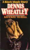 |
|